Menu
Menu
MuditSharma.art
Website Design and No-code Development for an Artist
MuditSharma.art
Website Design and No-code Development for an Artist
MuditSharma.art
Website Design and No-code Development for an Artist
Keywords
Web Design
Tools used
Figma, Editor X, Illustrator
Year
2023
Client
Mudit Sharma
Keywords
Web Design
Tools used
Figma, Editor X, Illustrator
Year
2023
Client
Mudit Sharma
Keywords
Web Design
Tools used
Figma, Editor X, Illustrator
Year
2023
Client
Mudit Sharma
Overview
Overview
Overview
Mudit Sharma is an artist who majorly works with photography, analogue mediums and crafts. He also runs Sandook, an archiving service brand.
The brief was to design and build a website on Editor X which would have two sections:
Mudit Sharma — a personal portfolio
Sandook — a separate space for the archiving service brand
Each section needed to have its separate identity, but should also feel like a cohesive experience.
There should also be provision to add a 'Shop' section later.
BEFORE
The old website was built on Wix, a non-responsive web-building platform. The website had a vertical menu on the left which listed all the projects, an image slider in the center displaying the images from a project, and a text block on the right showing the project name and a description.
Each project page was built manually. The vertical menu on the left was a list which had to be updated on every project page every time a new project was added. Also, since the website was not responsive, it looked very small in large displays.
Old websites pain points
Old websites pain points
Old websites pain points
Each portfolio page has to be built individually.
For each new work added, the menu had to be manually updated in every page. The higher the number of works, the more pages to be updated.
Did not scale to screen size. Looked bad on bigger screens.
Not optimized for mobile viewing.
Each portfolio page has to be built individually.
For each new work added, the menu had to be manually updated in every page. The higher the number of works, the more pages to be updated.
Did not scale to screen size. Looked bad on bigger screens.
Not optimized for mobile viewing.
Each portfolio page has to be built individually.
For each new work added, the menu had to be manually updated in every page. The higher the number of works, the more pages to be updated.
Did not scale to screen size. Looked bad on bigger screens.
Not optimized for mobile viewing.
Issues with templates
Issues with templates
Issues with templates
Lack of options on the platform
All templates are similar looking
Custom solution needed for the two independent sections: (1) Mudit Sharma, (2) Sandook.
Lack of options on the platform
All templates are similar looking
Custom solution needed for the two independent sections: (1) Mudit Sharma, (2) Sandook.
Lack of options on the platform
All templates are similar looking
Custom solution needed for the two independent sections: (1) Mudit Sharma, (2) Sandook.
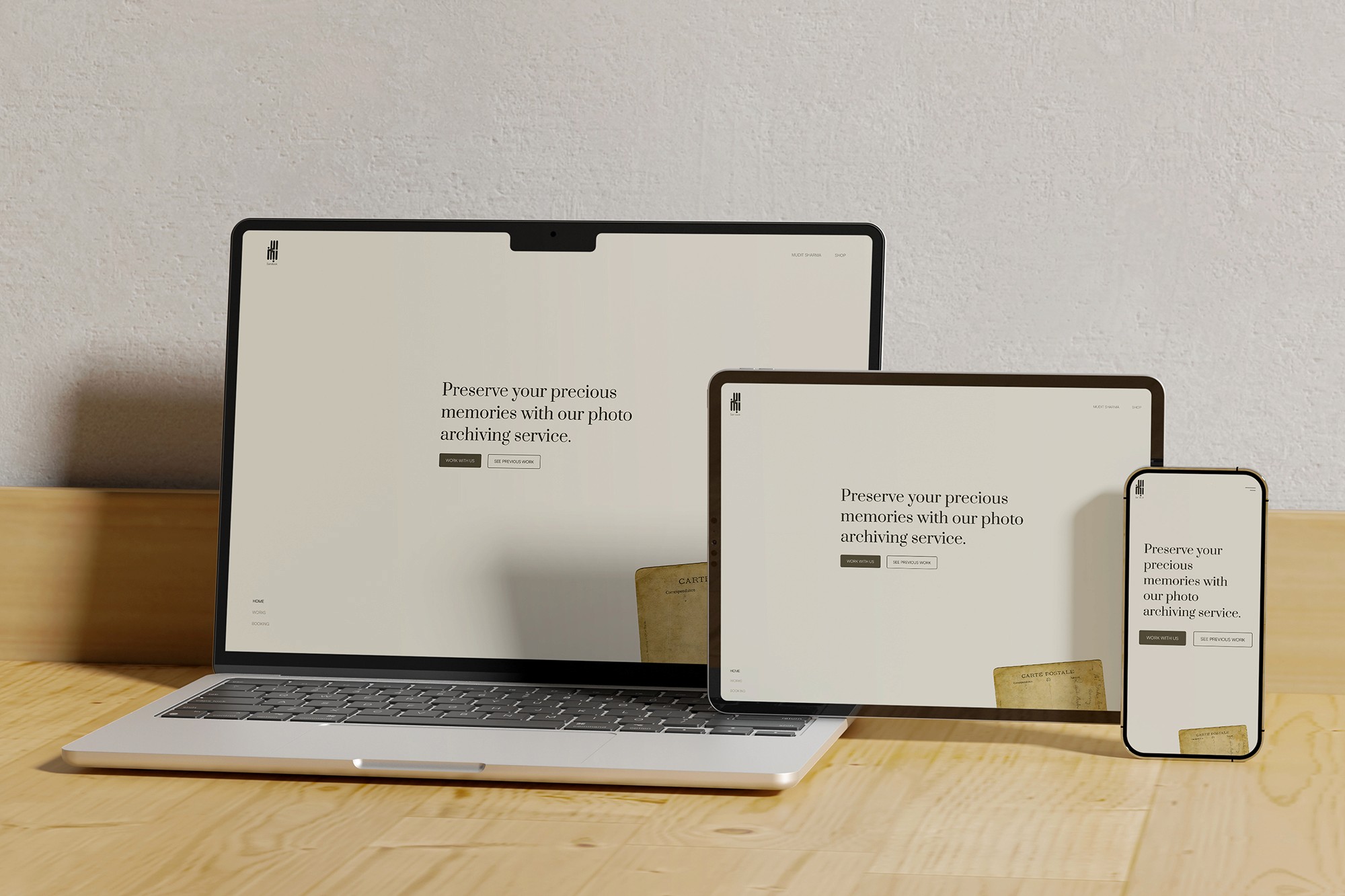
AFTER
The new website is built on Editor X, a responsive web-building platform by Wix. This was the platform of choice as it shares similarities with the Wix editor which the client was familiar with.
This new website uses CMS to display the portfolio items. To add a new work to the portfolio, the user simply has to open the respective database, create a new item, and input all the details into the fields.
Being responsive this website adjusts itself perfectly to every screen size.
The website has two independent sections with their own visual identities. It also has provision for a shop section.
Information Architecture
Information Architecture
Information Architecture

Sketches and Explorations
Sketches and Explorations
Sketches and Explorations


Colour
Colour
Colour
Mudit Sharma
Mudit Sharma
Mudit Sharma
Mudit Sharma’s work uses a lot of white spaces. He uses very few tools to produce his work, often occupying a small space in a clean and tidy room. This inspired the colour palette for this section, with a lot of white and minimal use of black and grey.
Mudit Sharma’s work uses a lot of white spaces. He uses very few tools to produce his work, often occupying a small space in a clean and tidy room. This inspired the colour palette for this section, with a lot of white and minimal use of black and grey.
Mudit Sharma’s work uses a lot of white spaces. He uses very few tools to produce his work, often occupying a small space in a clean and tidy room. This inspired the colour palette for this section, with a lot of white and minimal use of black and grey.
Sandook
Sandook
Sandook
Being an archiving service, Sandook works with a lot of old material, like old documents, notes, photographs etc. The colour palette for this section takes inspiration from old, yellowed paper.
Being an archiving service, Sandook works with a lot of old material, like old documents, notes, photographs etc. The colour palette for this section takes inspiration from old, yellowed paper.
Being an archiving service, Sandook works with a lot of old material, like old documents, notes, photographs etc. The colour palette for this section takes inspiration from old, yellowed paper.


Typography
Typography
Typography
Mudit Sharma
Mudit Sharma
Mudit Sharma
Mudit Sharma was already using Satoshi for his website and other works. This clean, simple typeface fits the aesthetic of his work perfectly. The Mudit Sharma section uses this typeface for all its text.
Mudit Sharma was already using Satoshi for his website and other works. This clean, simple typeface fits the aesthetic of his work perfectly. The Mudit Sharma section uses this typeface for all its text.
Mudit Sharma was already using Satoshi for his website and other works. This clean, simple typeface fits the aesthetic of his work perfectly. The Mudit Sharma section uses this typeface for all its text.
Sandook
Sandook
Sandook
Since Sandook deals with old, valuable objects, it required a treatment to represent that. Prata, a high-contrast display serif typeface complements Satoshi to bring a richer look to the Sandook section.
Since Sandook deals with old, valuable objects, it required a treatment to represent that. Prata, a high-contrast display serif typeface complements Satoshi to bring a richer look to the Sandook section.
Since Sandook deals with old, valuable objects, it required a treatment to represent that. Prata, a high-contrast display serif typeface complements Satoshi to bring a richer look to the Sandook section.


Grid
Grid
Grid
The basis for the structure of this website is a Fibonacci grid.
The basis for the structure of this website is a Fibonacci grid.
The basis for the structure of this website is a Fibonacci grid.


Mudit Sharma
Mudit Sharma
Mudit Sharma

Sandook
Sandook
Sandook
Error 404
Error 404
Error 404
